In Spring 2024, I undertook the challenge of crafting a design system, through this experience I worked on my skills in component design and documentation creation to ensure that the design system meets technical requirements, is easy-to-use, navigate and scale.
Project Apporach
This design system offers an extensive collection of design principles, elements, and assets, enabling developers and designers to construct cohesive interfaces.
Implementing a design system allows to prioritise structured workflows and efficiency, optimise the design, development, and testing processes. This approach helps to reduce bugs, minimise technical debt, and support flexibility and scalability in design.
The Solution
Visual Consistency: a cohesive visual language across all components
Responsive Design Guidelines: implementing guidelines to ensure components adapt seamlessly to various screen sizes
Interaction Patterns: defining how components respond to user input or system events
Artifacts:
Styles: icons, typography system, color scheme (styles, variables), layout, spacing
Components: naming, component categories, interactions
Specifications


Establishing the Foundations
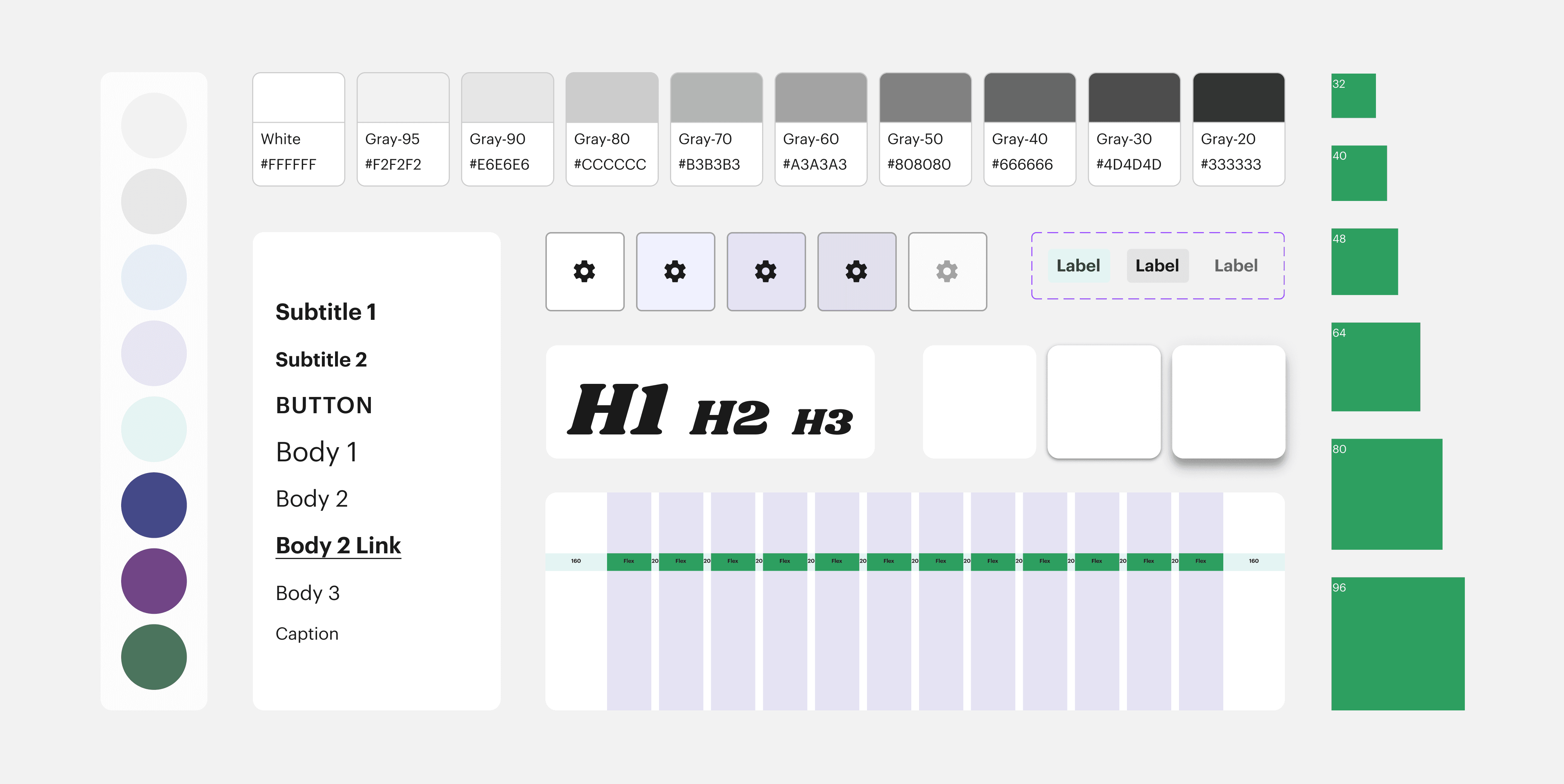
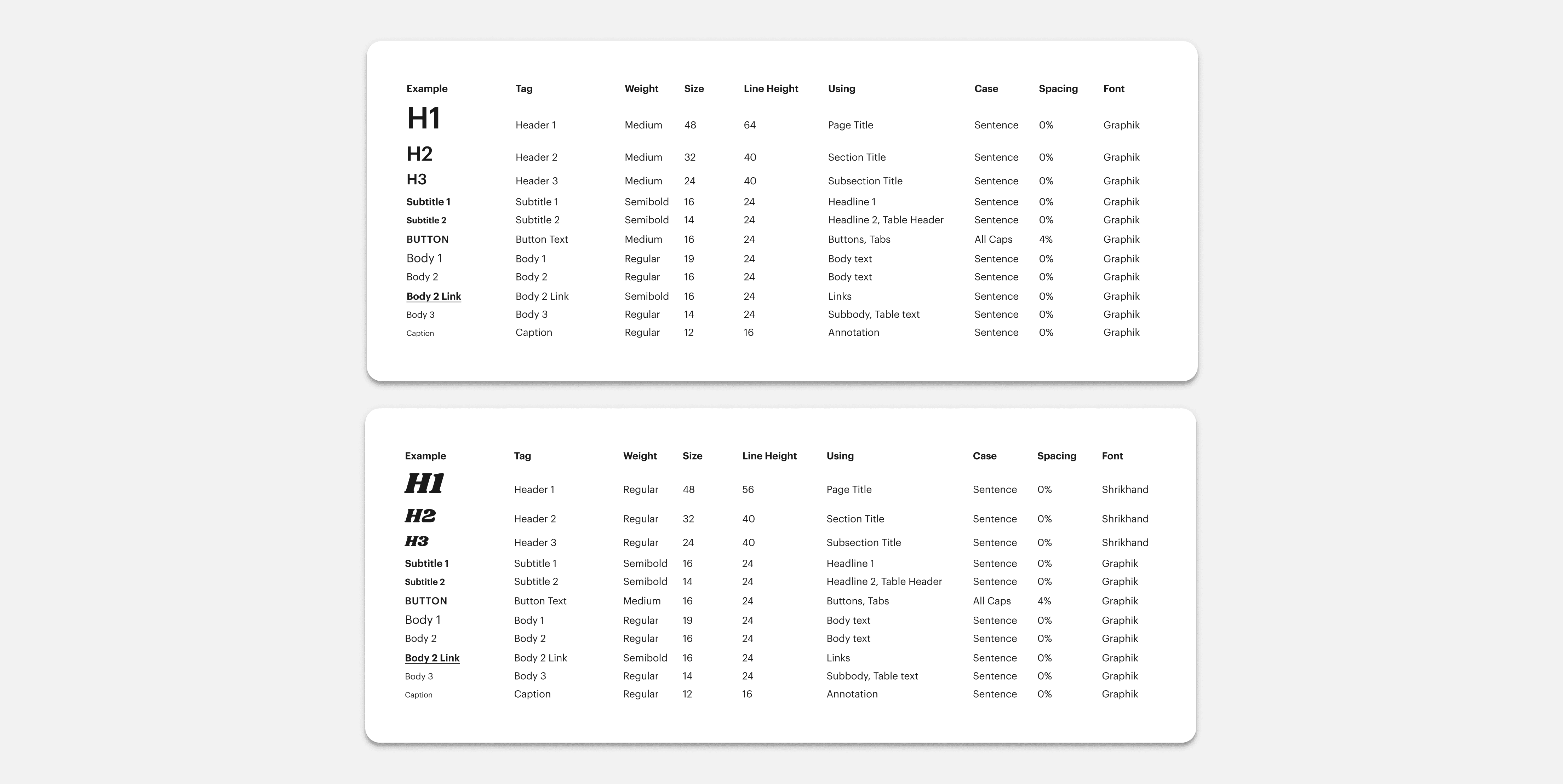
Typography System
The work on the design system began with establishing its core components. I made the typography scale, which serves as the basis for our sizing system, incorporating line-heights and font sizes.
Adding an Expressive Font to Headings to enhance aesthetic appeal. It helps to create attractive design elements and capture users' attention.
Color Scheme
Web Accessibility of Colors: I defined and applied color palettes that meets WCAG 2.0 AA color accessibility guidelines, ensuring all colors have sufficient contrast.
Adding Variables: All defined color styles were converted into variables. This allows easy updating, ensuring consistency across the entire project.

Spacing
Standardised values for spacing between elements help to maintain visual hierarchy and consistent content placement on the page.

Layout Grid
A structured grid system was made to ensure unity across different screen sizes and layouts.

Elevation
Elevation standards were defined to establish visual depth and hierarchy.

Create easy-to-use Components
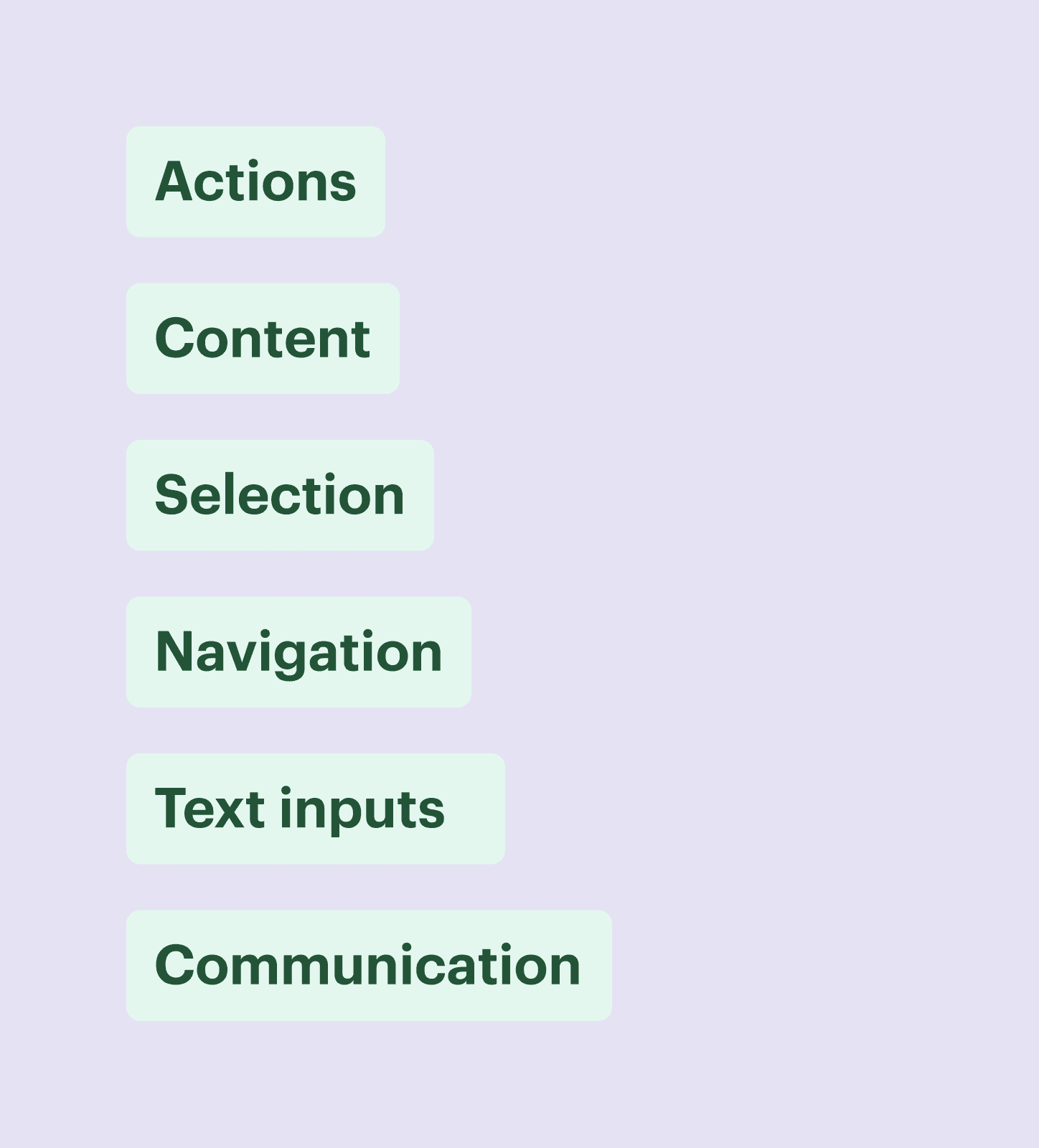
Organisation of Components into Groups
Components were organised into logical groups based on their functionality, purpose, or usage context. This helps users easily locate and understand available components within the system.
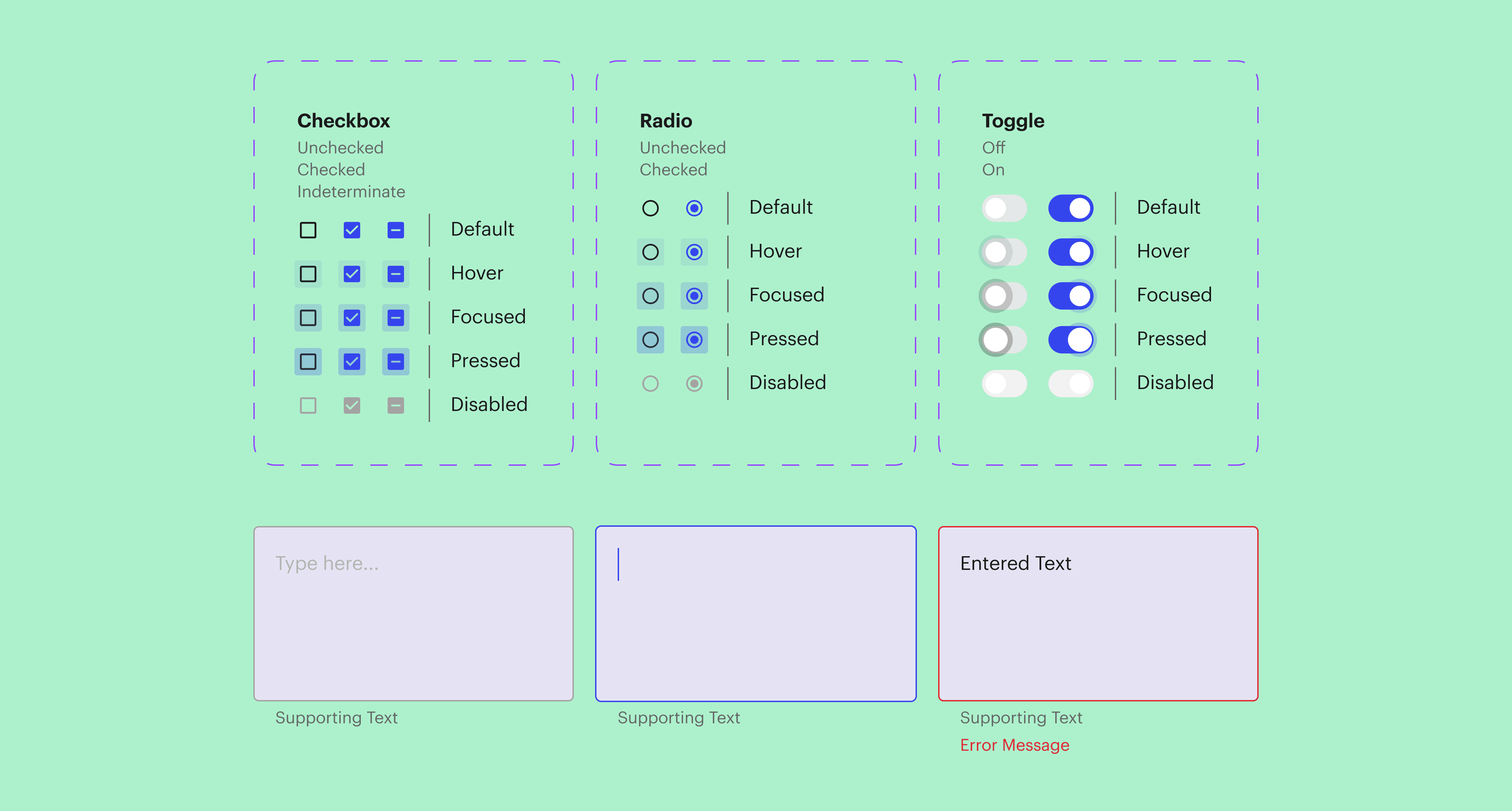
B. Component States and other Properties
Different states of components were defined and documented. These states include variations such as hover, active, focus, disabled, etc. That helps to have a guidance on how components should behave in various scenarios.

Reflecting on the Journey
I've gained valuable skills that have enriched my professional development. Embracing feedback, iterating and continuously refining designs have become integral parts of my workflow.
Learning the details of different design systems has improved my ability to balance aesthetic considerations with functional requirements and to ensure that design decisions are grounded in usability principles.
Thank You for Reading!

For more work inquiries, or to grab a coffee do email me at oliinyk.liuba@gmail.com